Ditching Spreadsheets and Empowering Financial Plans
Cut manual advisor work by 40% and support calls by 30%, while reducing onboarding time from two weeks to one.
- ↓ Manual advisor updates −40%
- ↓ Support calls −30%
- ↓ Onboarding time 2 wks → 1
Walkr · 2019 · Workshop facilitation, Interaction design, UI design
Context
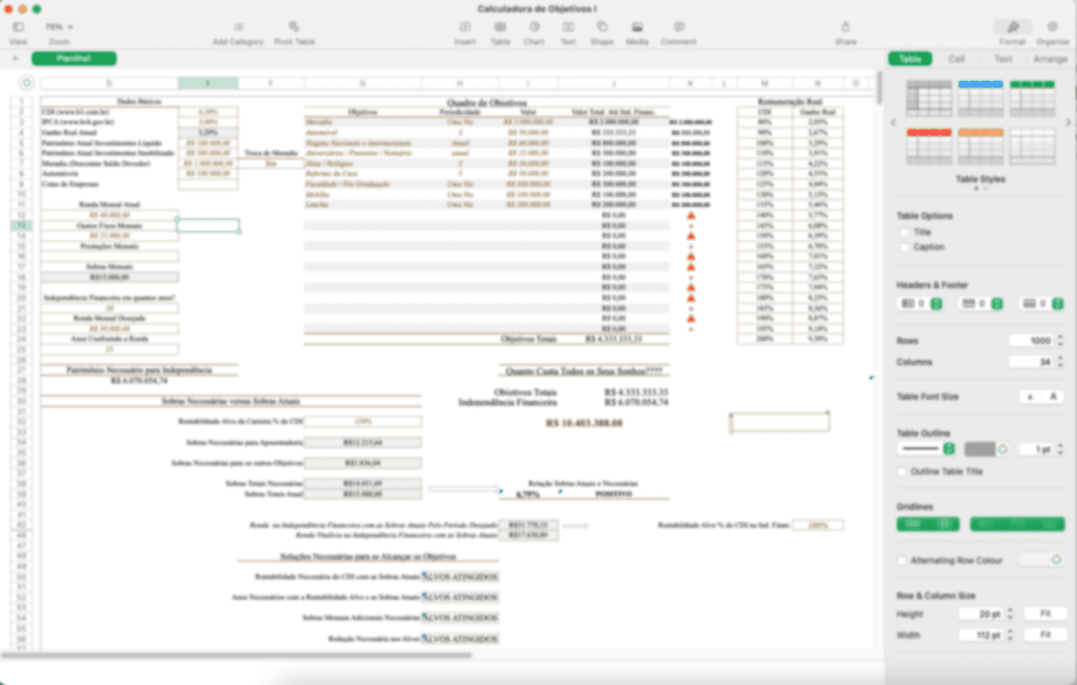
WalkrApp, a leading Brazilian financial planning company, faced two critical challenges: confusing client experiences and operational inefficiencies caused by their complex spreadsheet-based system. Clients struggled to navigate their plans, which damaged both goal achievement and brand trust. Specialists were bogged down with manual tasks that limited their ability to provide personalized guidance.
The spreadsheet wasn’t the cause; it was the symptom. The real problem was that the artifact advisors used internally was the same artifact they tried to explain externally. Two audiences, one tool, neither well-served.
Goals
My team and I undertook a human-centred approach to develop and launch a user-friendly interactive MVP aimed at three outcomes:
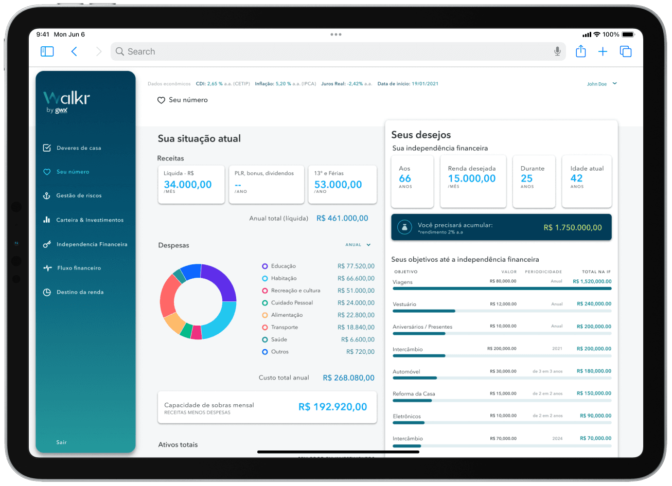
- Client Empowerment — Simplify financial data visualization through intuitive dashboards that let clients track progress toward goals and celebrate milestones.
- Specialist workflow optimization — Streamline data collection and input so advisors spend more time on guidance and less on administration.
- Knowledge Continuity — Build a collaborative environment that safeguards institutional expertise against talent turnover.
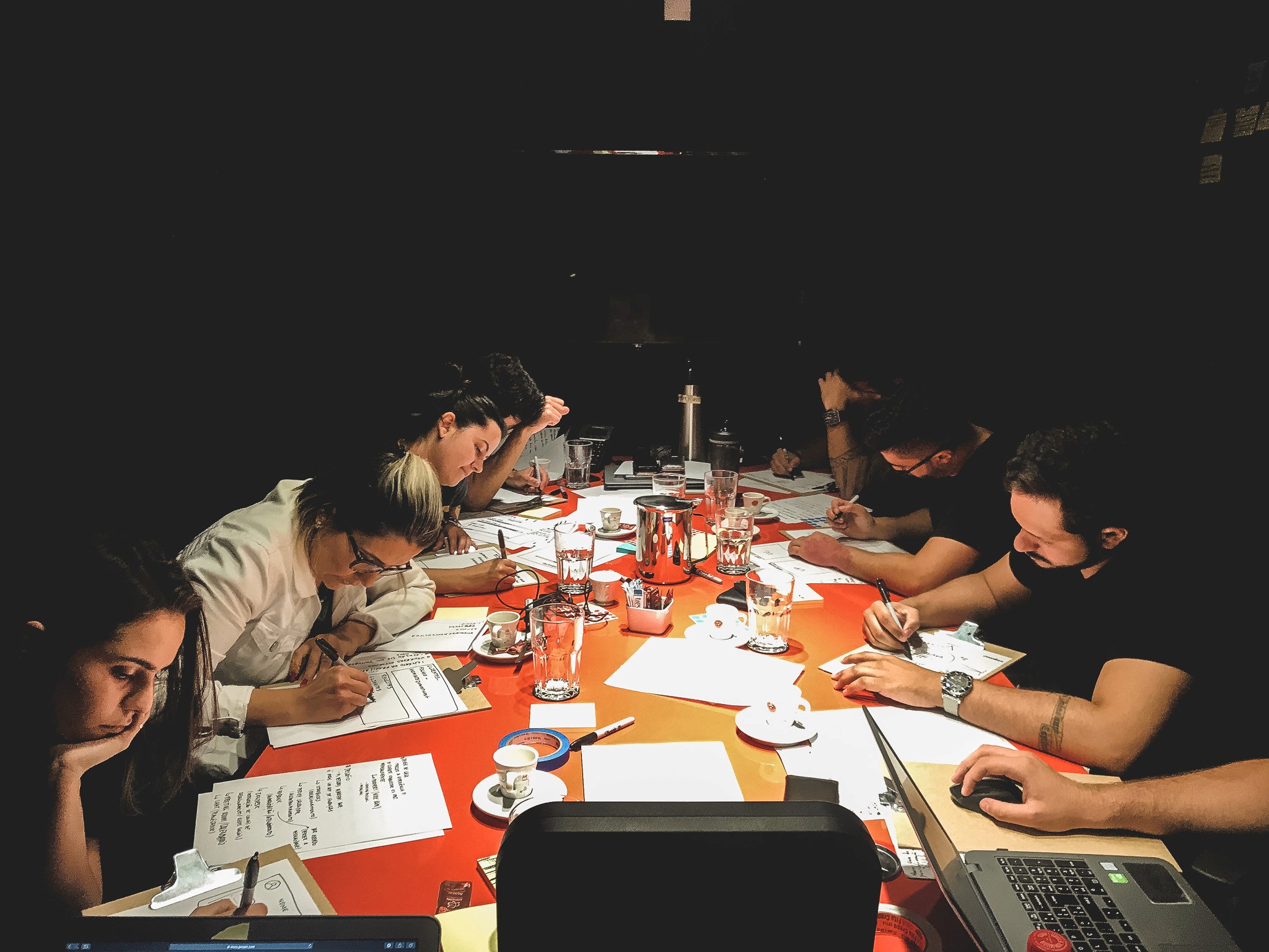
Design Sprint
To uncover Walkr’s landscape, we ran a three-day design sprint — a whirlwind of collaboration. I recruited a diverse team: the company’s visionary founder, experienced financial planners, and customer-centric marketing and service specialists, united in a shared mission.
Day 1: Cracking the Code
I kicked off with an overview of a Money Heist-themed design sprint. This playful theme boosted team spirit and served as a fitting analogy for our mission: reinventing Walkr’s experience.
We then mapped the company’s operations collaboratively, charting every turn of the financial planning process. The founder and key experts shared their vision and daily challenges; the team transformed those insights into “How might we” questions and clustered them on an affinity map. Three key challenges emerged:
- How might we standardise the formulary completion process?
- What would allow for a more straightforward training process for financial advisors?
- How might we help customers understand their financial plan via the app?
As the day closed, each team member picked an app from outside the financial world and prepared a short presentation showing its potential to solve our challenges.
Day 2: The Great Sketch Heist
Each team member presented how their chosen app could offer innovative solutions to our challenges. Fabulous — a habit-building app — caught everyone’s attention, sparking possibilities for fostering healthy financial habits.
We used a democratic voting system to prioritize the most promising inspirations, then unleashed a sketching frenzy with Crazy 8s: eight quick ideas each before diving into deeper sketches. It was surprising how engaged the non-designers were; I’d wrongly expected them to be shy. Not the case.
Day 3: From Prototype to Decisions
The final day was a showcase of polished ideas. Each team member presented their solutions, sparking lively discussion. Using a voting system, we identified the most promising directions and walked away with a clear roadmap and a shared vision — built by the team, for the team.
Key decisions
01
Split the internal tool from the client-facing artifact, sharing only the underlying data
Why One artifact serving two audiences was the root cause. Separating the surfaces let each one be optimized for its actual reader.
Trade-off Two surfaces means two things to design and maintain. We accepted the cost — the alternative was a permanent 50% advisor productivity tax.
02
Designed dashboards around financial milestones, not financial line items
Why Clients didn't get confused by numbers. They got confused by what the numbers meant for their goals.
Trade-off Some advisors initially missed the line-item view. We added it as a secondary tab rather than the default — keeping the primary view milestone-led.
03
Designed the advisor input form around the data-collection conversation, not the database schema
Why Advisors collected data in a specific order during client calls. Matching the form to that order eliminated re-typing and made the form learnable in one session.
Trade-off The form's field order doesn't match the underlying database, which adds a small mapping layer. Worth it — the advisor's time is more expensive than the developer's.
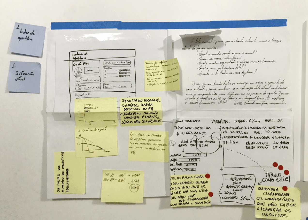
Prototyping
Armed with low-fidelity prototypes and mind-maps from the sprint, I partnered with a developer and dove into Walkr’s existing spreadsheet system — a complex web of information begging to be transformed. While my focus lay in weaving data into a clear visual narrative, my partner tackled the underlying mathematical foundations.
Recognising the founder’s vision for intuitive dashboards, we co-created an initial design to demystify financial plans for clients. Feedback flowed freely through rapid iteration loops, allowing me to refine the design with agility.
I worked in parallel on a mind-map to streamline data collection for financial advisors — not just for efficiency, but to liberate advisors from tedious tasks and let them focus on personalized guidance and genuine client relationships.
Our initial prototypes were functionally sound, but the founder pointed out a void: the absence of personal touch, the human narrative woven into the cold fabric of data. Given the MVP constraints, we made a strategic decision — prioritize practicality now, lay the groundwork for future embellishments. Each iteration was a brushstroke on WalkrApp’s transformation canvas.
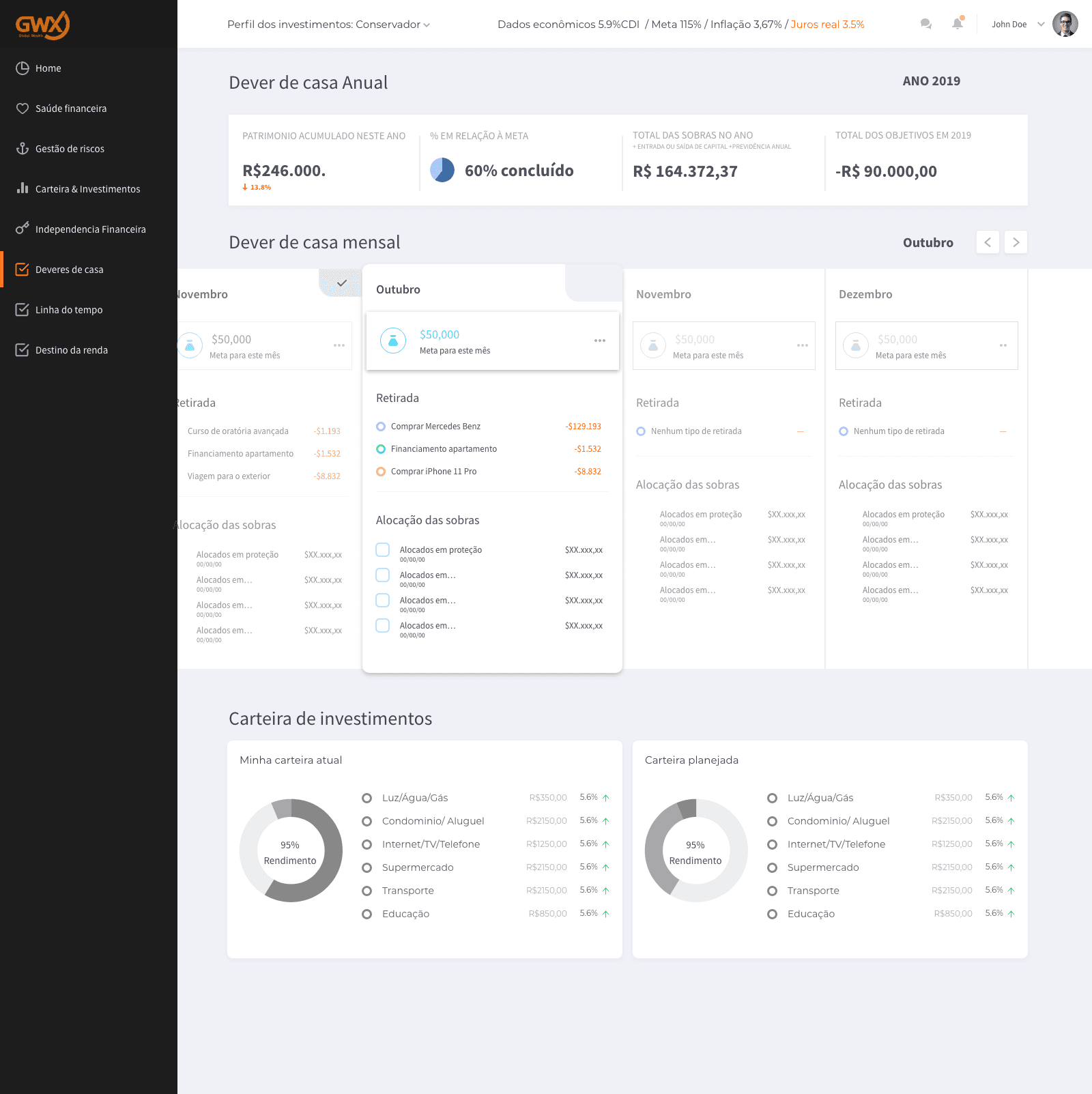
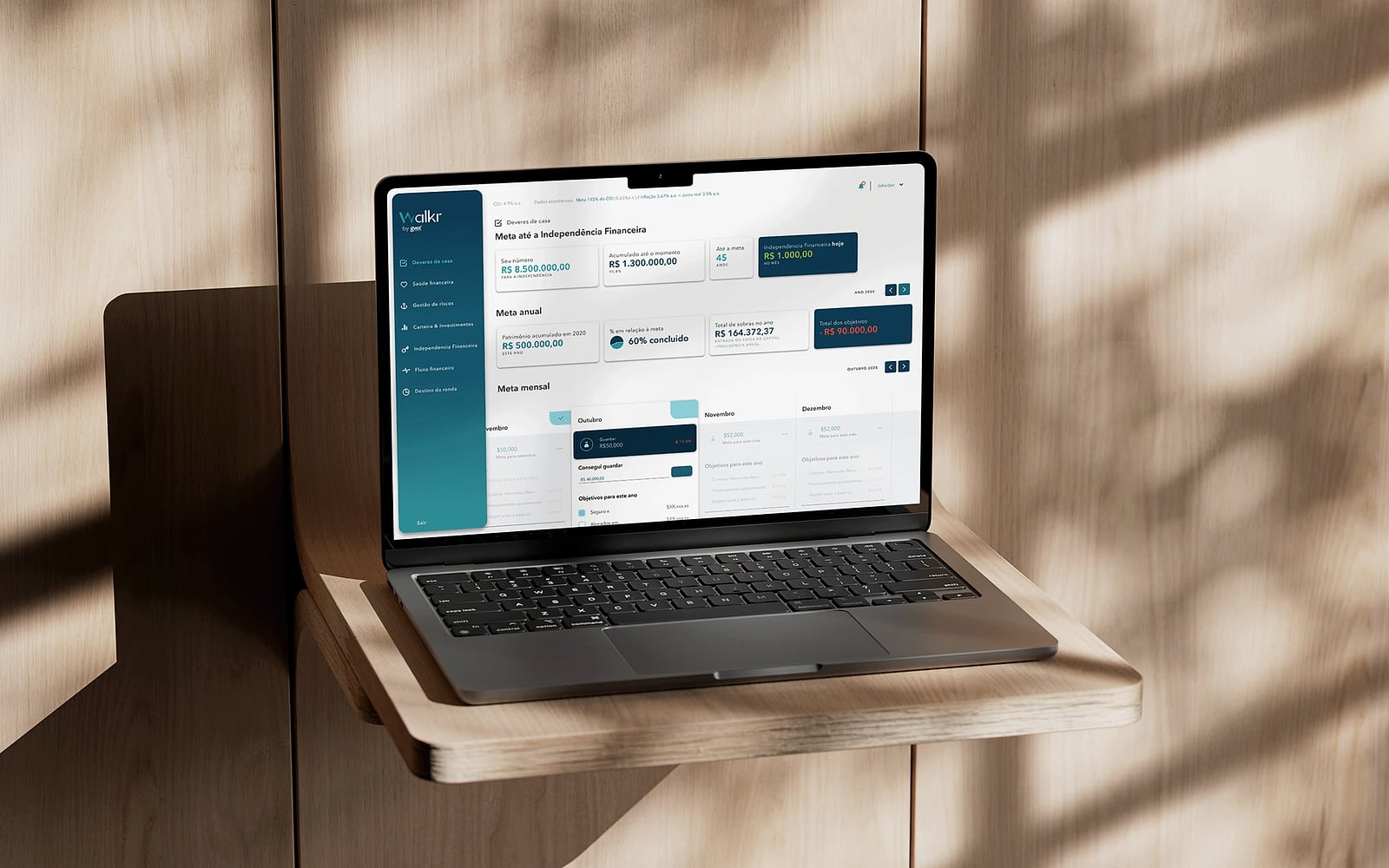
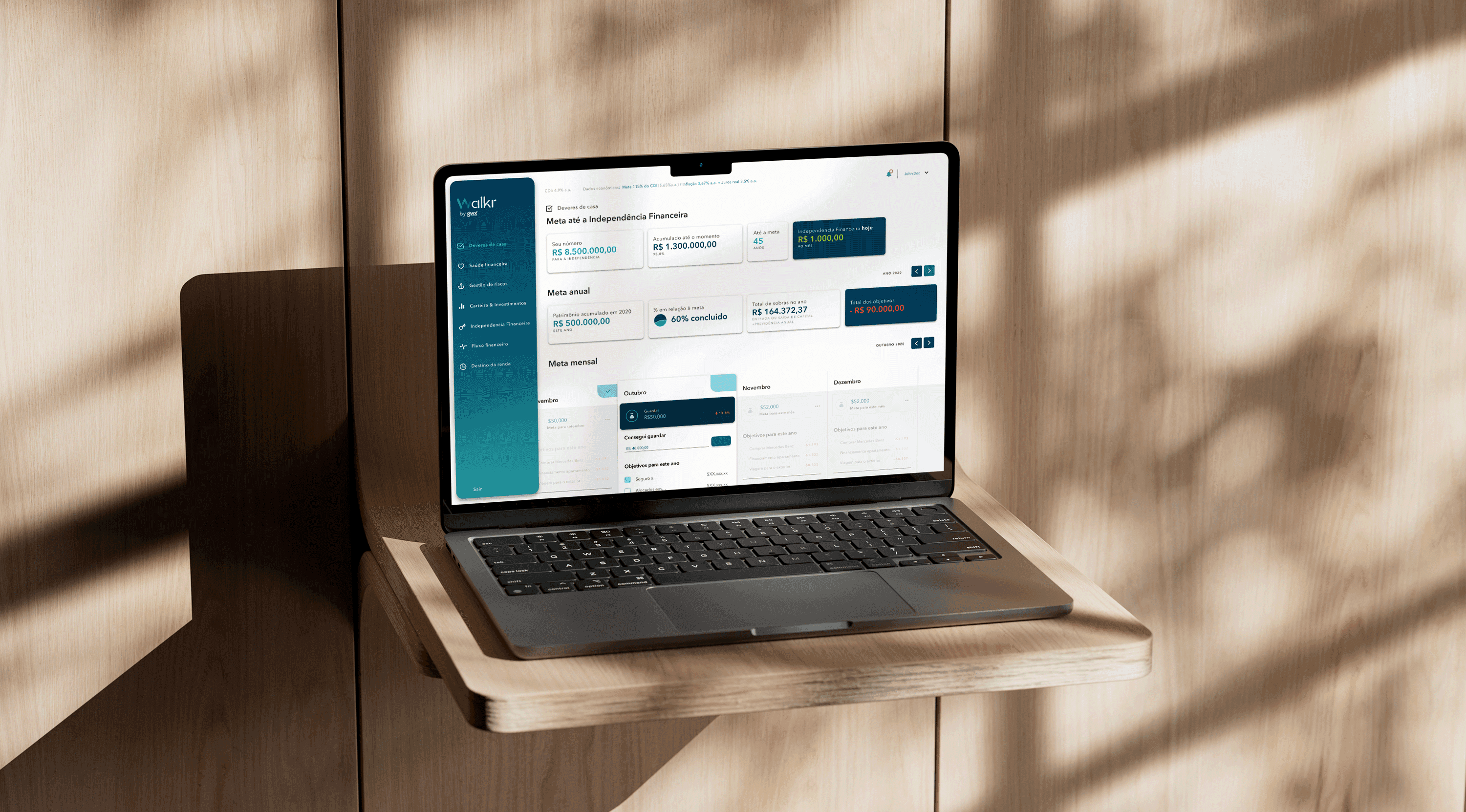
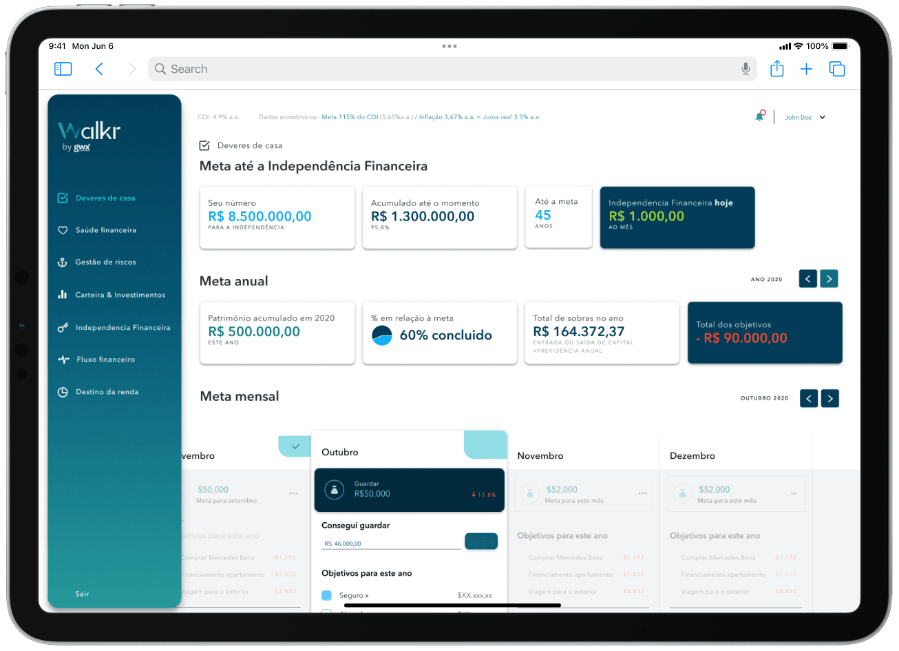
Final design
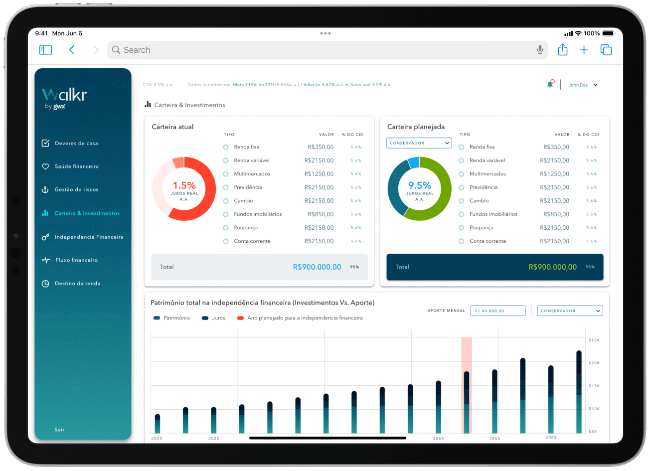
After prototyping the possibilities, this phase transformed conceptual designs into tangible, interactive dashboards that resonated with Walkr’s brand identity.
Seven dashboards replaced the sprawling spreadsheet, clustering information around key themes. These digital tapestries made financial insights clear and captivating for users.
Formulary design wasn’t just about functionality — it respected the flow financial advisors were already used to. Segmenting data input mirrored the familiar process, ensuring ease of use and seamless transition from old to new.
Each element underwent rigorous design reviews throughout development, ensuring the final product stayed true to the initial vision in both usability and aesthetic appeal.
Impact
The MVP wasn’t just user-friendly — it tackled inefficiency head-on.
| Metric | Before | After | Change |
|---|---|---|---|
| Manual updates per advisor week | Baseline | — | −40% |
| Client support calls about plan confusion | Baseline | — | −30% |
| New-advisor onboarding time | 2 weeks | 1 week | −50% |
Learnings
This project was a pivotal moment in my freelance career. It bolstered my confidence and gave me deeper insight into financial planning as a domain. One of the highlights was the client’s enthusiastic response to our initial digital transformation sketches — a reminder of how powerful it is to show, not tell.
- Constraints clarify. Solo designer, single developer, founder-as-PM forced fast decisions and prevented analysis paralysis.
- Prototype the client-facing surface first. We built both surfaces in parallel; in retrospect the client dashboard was higher-leverage and would have benefited from earlier, rougher iteration.
- Match forms to conversations, not databases. The biggest usability win came from reordering fields to follow the advisor’s natural call flow — a one-day design decision that eliminated a week of advisor re-training.
- Non-designers can sketch. The Crazy 8s session with the non-designer team members produced ideas we wouldn’t have reached alone. Always bring the room into the design process.
Design artifacts
Sprint affinity map
AnonymizedArtifact image placeholder
Synthesis board from the 3-day sprint showing pain points, voted HMW questions, and selected direction.
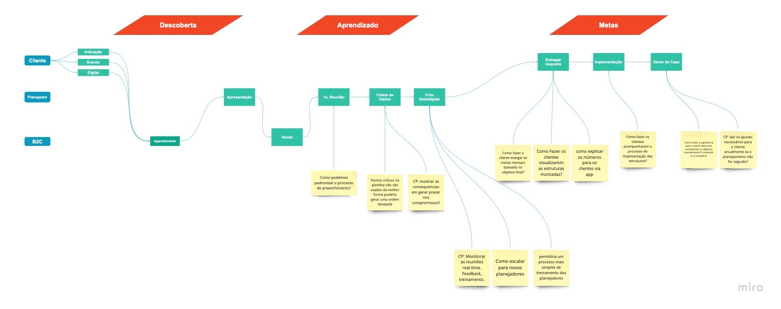
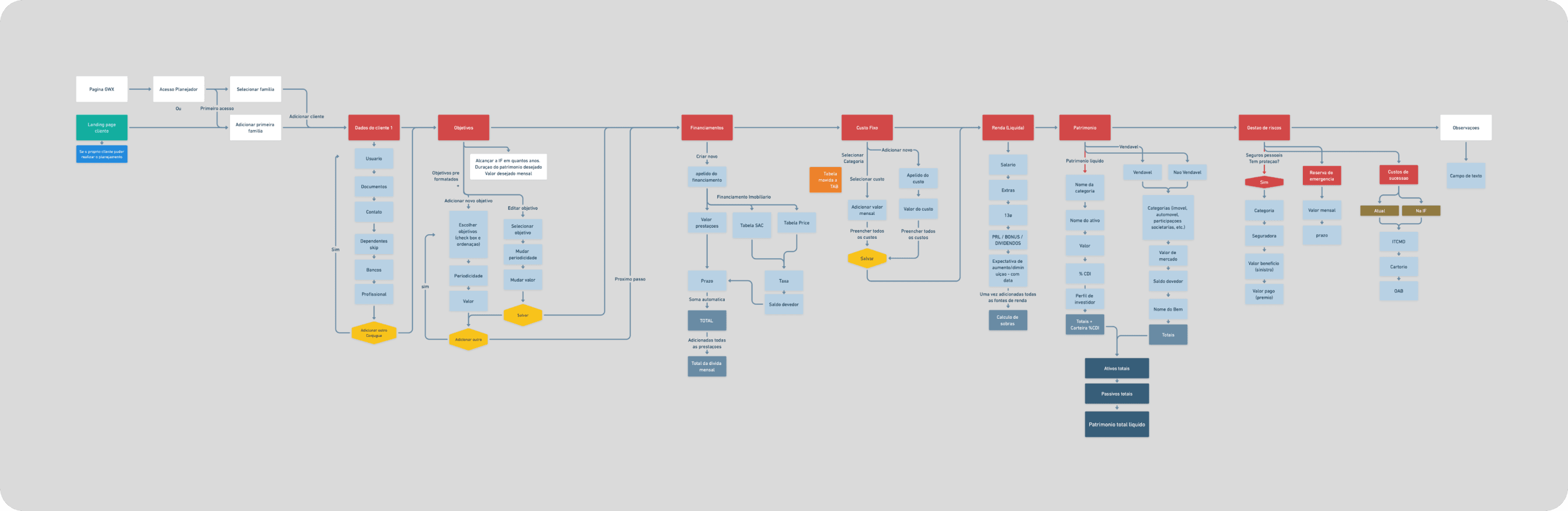
Advisor-to-client flow split
NDA-safeArtifact image placeholder
Flow diagram documenting where internal advisor tasks diverge from client-facing narrative dashboards.
MVP interaction states
RedactedArtifact image placeholder
Low-to-high fidelity state progression used to align founder and engineering on build order.