Helping Apple's fans get the latest and greatest
Designed a mobile platform for Apple Stores that let customers buy devices through Santander flexible financial plans, scanned via QR code at point of desire.
Santander · 2020 · Interaction Design, UI Design, User Research
The problem
The Apple Store is designed to create desire — clean tables, glowing screens, and the promise of a faster, better version of yourself. But desire and budget don’t always align. Customers leave the store with the same devices they walked in with, not because they don’t want to upgrade, but because the gap between yearning and owning feels unbridgeable in the moment.
Santander saw that gap as an opportunity. By partnering with Apple, they could offer flexible financial plans that turned a lump-sum purchase into manageable monthly payments — but only if the experience of discovering, customizing, and financing a device felt as seamless as the rest of the Apple Store.
The challenge wasn’t purely financial. It was behavioral: how do you introduce a financing decision at the exact moment of highest desire, without breaking the spell?
How we worked
Desk research inside the Apple Store experience
Before designing anything, we studied how customers actually behave in Apple Stores — not how Apple intends them to behave, but what happens when desire meets budget reality. We reviewed customer feedback, observed browsing and purchase patterns, and mapped the emotional arc of the in-store journey: from attraction to customization to the final moment where price becomes unavoidable.
That research surfaced five non-negotiable needs that the platform had to serve:
- Convenient purchasing process — Customers need a simple, effortless way to buy products in the store, not a detour to a different building or website.
- Time-efficient browsing — They require a quick and efficient way to browse and customize products that meet their needs, without losing momentum.
- Flexible financial plans — Customers need options to split costs into monthly payments so the decision feels manageable, not monumental.
- Clear upgrade path — They want an easy way to stay current with the latest products, not a one-time transaction.
- Seamless integration — New devices need to feel like a natural continuation of what they already own, not a parallel system to manage.
User flow and information architecture
With those needs as anchors, we mapped the complete purchase journey — from the moment a customer scans a QR code near a display device, through product customization and plan selection, to final approval and activation. Every step was designed to minimize friction and keep the user inside the same mental model: I want this, and I can have it.
End-to-end user flow and information architecture — from QR-code entry through product customization, plan selection, and final purchase activation.
A digital platform that feels native to the store
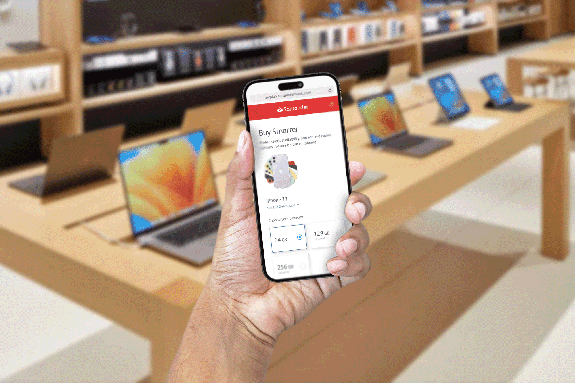
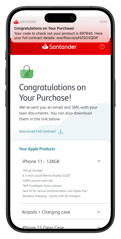
The platform was built as a mobile web experience, accessed via QR codes placed directly on Apple Store displays. There was no app to download, no account to create upfront, and no paperwork to sign. The entire journey — browsing, customizing, selecting a financial plan, and confirming the purchase — stayed inside the same flow, on the same device, in the same chair where the customer first picked up the product.
Key decisions
01
Built a mobile web platform accessed via QR code, not a native app or in-store kiosk
Why The moment of desire is fragile. Adding steps — download an app, walk to a kiosk, fill out a form — breaks the emotional momentum. A QR-to-web flow keeps the customer in the same physical and mental space where the desire formed.
Trade-off Web has fewer native capabilities than an app. We accepted the constraint and designed around it rather than asking customers to leave the table.
02
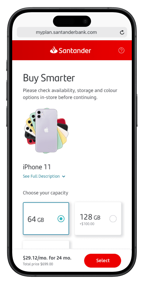
Front-loaded product customization before introducing financing, not the reverse
Why Customers come to the Apple Store to fall in love with a product first. Leading with financing frames the conversation around money, not desire. By letting them configure color, storage, and accessories first, the monthly price is anchored to *their* specific choice, not an abstract loan.
Trade-off The financing step arrives later in the flow, which means some users might not reach it. We mitigated by keeping the customization phase fast and visually lightweight.
03
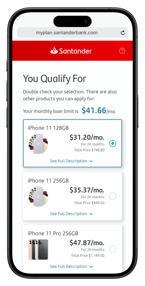
Designed the financial plan selection as a choice between clarity, not comparison overload
Why Too many plan options create decision paralysis. We structured the financing step around a small number of clear, pre-calculated monthly amounts tied to term length — not an open calculator. The customer sees: *this is what you pay, this is for how long.*
Trade-off Less flexibility for edge-case budgets. The trade-off was worth it: most customers need reassurance, not a spreadsheet.
The result
The platform turned the Apple Store from a place of desire-and-departure into a place of desire-and-action. Customers could customize their dream device, see a monthly payment that fit their budget, and complete the purchase without ever leaving the table.
Product browsing and customization — customers configure their device without leaving the display table.
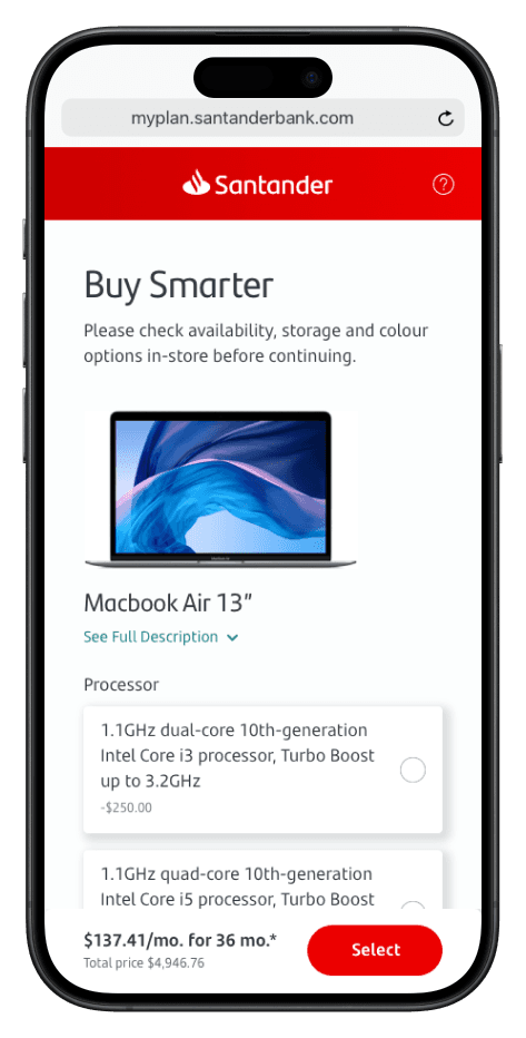
Plan selection — monthly amounts are presented clearly, not as an open calculator.
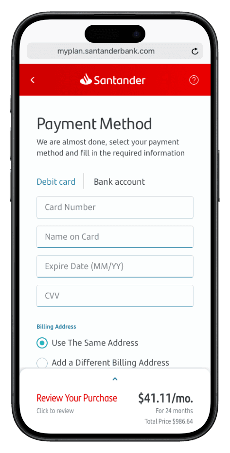
Checkout confirmation — the final step keeps the same lightweight, in-store mental model.
Device integration — connecting the new purchase to existing Apple devices for a seamless handoff.
Upgrade path — the platform stays alive after purchase, making future upgrades feel natural.
Key artifacts
Design artifacts
In-store customer behavior research synthesis
AnonymizedArtifact image placeholder
Desk research findings mapping emotional and behavioral patterns of Apple Store customers at the moment of purchase decision.
End-to-end user flow and IA map
NDA-safeArtifact image placeholder
Complete journey map from QR-code scan through customization, plan selection, checkout, and post-purchase activation.
Mobile UI design system
RedactedArtifact image placeholder
Component library and screen designs for the mobile web platform, built to feel native to the Apple Store environment.
Looking back
The hardest part of this project was respecting the Apple Store’s emotional logic. Financing is usually a rational, paperwork-heavy process. Placing it inside a space designed for desire required us to strip away every administrative signal — signatures, fine print, comparison tables — and replace them with clarity and confidence.
What worked: Anchoring the design to the five customer needs we identified in research. Every screen was tested against those needs, not against feature completeness. That kept the platform focused when the natural tendency was to add more plan options, more legal copy, more steps.
What was hardest: Getting the financing presentation right. Too simple and it feels like a trick; too detailed and it feels like a bank branch. The final approach — a small set of pre-calculated monthly amounts — emerged from watching customers freeze when faced with open calculators.
What I’d do differently: I’d want to instrument the QR-code entry point more precisely. We knew the platform worked for people who scanned the code, but we had less signal on why some display browsers didn’t take that step. Understanding that hesitation would sharpen the physical-to-digital handoff even further.