Replacing filter-based apartment search with a conversation
I replaced a 20-filter apartment search with a guided conversation — grounded in behavioral science and AI trust research — so renters could move from vague intent to confident shortlist.
- ↑ Listings viewed 2×
- ↑ Tour request rate +47%
- ↑ AI trust (transparency) +36%
Markerr · 2025 · Design for AI, Behavioral UX Research, UI Design, Conversational Patterns
TL;DR — I replaced a 20-filter apartment search with a guided conversation — grounded in behavioral science and AI trust research — so renters could move from vague intent to confident shortlist.
Context
A filter panel assumes the user already knows what they want. Most renters don’t.
This project was never really about designing a UI. It was about integrating LLM behavior, RAG-grounded outputs, and behavioral psychology into a single experience that could earn the trust of Americans making one of the most financially and emotionally loaded decisions of their lives — finding a home. The interface was the last layer, not the first problem. And underneath it all was a second integration challenge just as hard: making a high-quality conversational experience feel seamless on top of rich, structured real estate data — so that the intelligence Markerr had built for institutions could finally speak to a renter in plain language.
Markerr had the data engine — rent forecasts, market comps, neighborhood signals already powering institutional investors. The next challenge was putting that same intelligence in the hands of renters across Markerr’s property management partners: hundreds of thousands of units, and a search experience that expected certainty from people who had none.
Ask Markerr became the answer — a conversational AI layer sitting on top of Markerr’s data engine, surfacing the right properties through dialogue rather than filter panels.
Role
I was the solo Product Designer on this engagement — research synthesis, information architecture, interaction design, and annotated handoff specifications across iOS mobile and desktop web, over approximately 20 weeks.
I worked in close collaboration with Markerr’s product and data teams and their property management partners’ digital experience teams.
The constraints were real from day one:
- Trust had to be earned quickly — users were handing personal context to an AI they had never met.
- Dealbreakers (price, pets, accessibility) could not be buried behind extra taps.
- The flow had to feel guided without removing the user’s sense of control.
Discovery
My research ran two parallel tracks from day one.
Track 1: How people actually search for housing in America. What I found disrupted my initial assumptions. Fifty-nine percent of renters are browsing with no firm move-in date — they are explorers, not decisive buyers. Their search is inherently social: couples have documented disagreements about budget (24%), space (22%), and duration (20%). Families spend weeks researching school districts before booking a single tour. First-time renters bring their parents. The decision is rarely made by one person, alone, in one session.
What struck me most was the consistency of the first question renters ask, across every segment: “What’s included in the rent?” Not neighborhood. Not square footage. Financial transparency before anything else.
Track 2: How Americans behave when interacting with LLMs. Over 52% of U.S. adults now use conversational AI — but 40.7% remain skeptical of what it tells them. Thirty-two percent rarely feel understood by chatbots. The root cause is a mental model mismatch: people bring human conversational expectations and the AI disappoints them. The most common failure modes aren’t bad answers — they’re poor error recovery, no visible reasoning, and no feedback that the system actually got what you meant.
Seen through a behavioral design lens, both problems share the same root failure: systems built for users who already know what they want. The filter panel assumes a certain user. The chatbot assumes a certain user. Most renters are not that user.
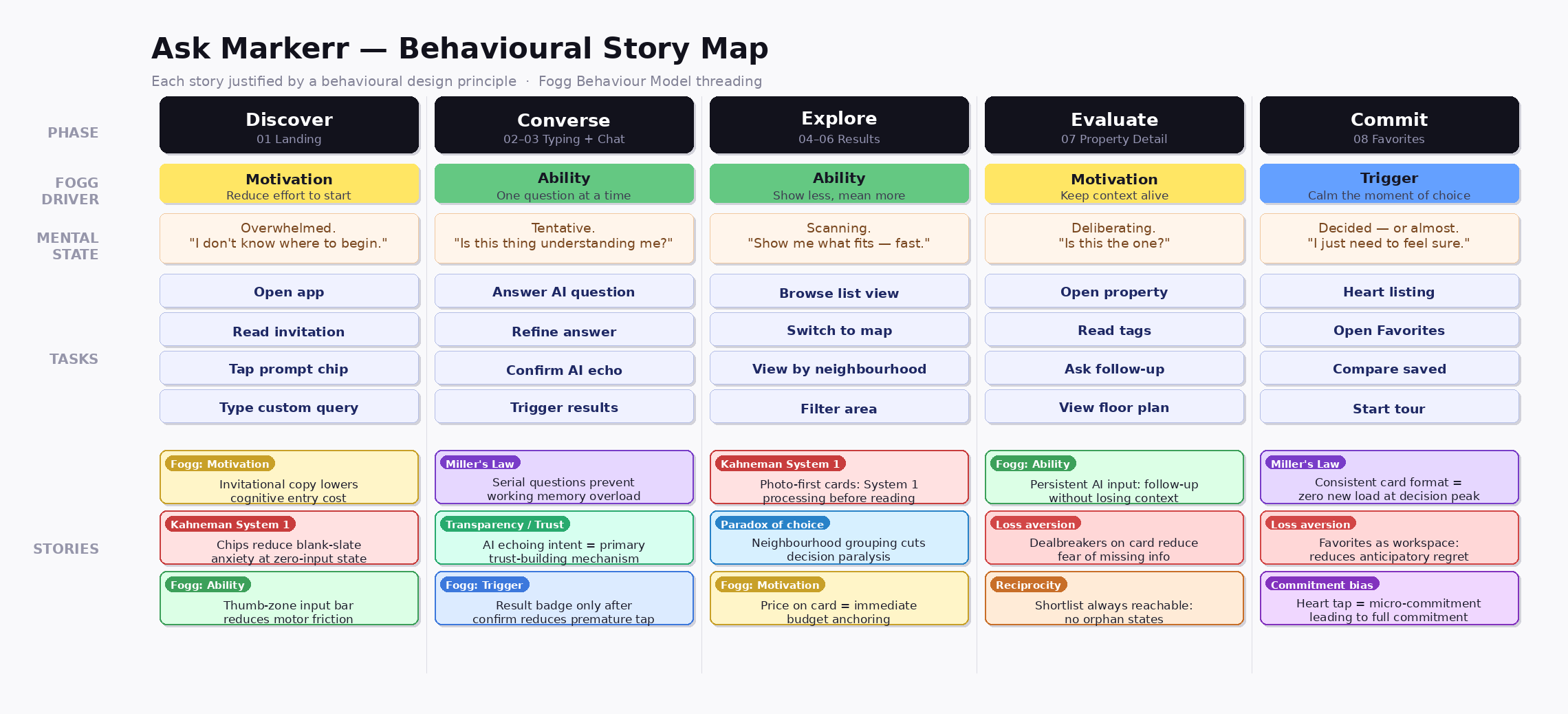
Behavioral story map — I mapped renter anxiety moments (cost transparency, pet policy, comparison overwhelm) directly to interface behaviors so research stayed tied to what we actually shipped.
Reframing
After research, the brief quietly shifted. The original framing was: make apartment search feel more modern. The reframing was: design for the uncertain renter, not the certain one.
A feature-led redesign would have shipped faster and changed almost nothing — users would have brought the same uncertain intent to a more modern interface.
This changed everything downstream. It meant the interface couldn’t front-load choices. It meant the AI had to earn trust before showing results, not after. It meant dealbreakers had to be on the surface, not behind a tap.
The HMW that guided the design: How might we help renters who start with a feeling — not a spec sheet — reach a confident shortlist without becoming their own filter engineers?
Design Decisions
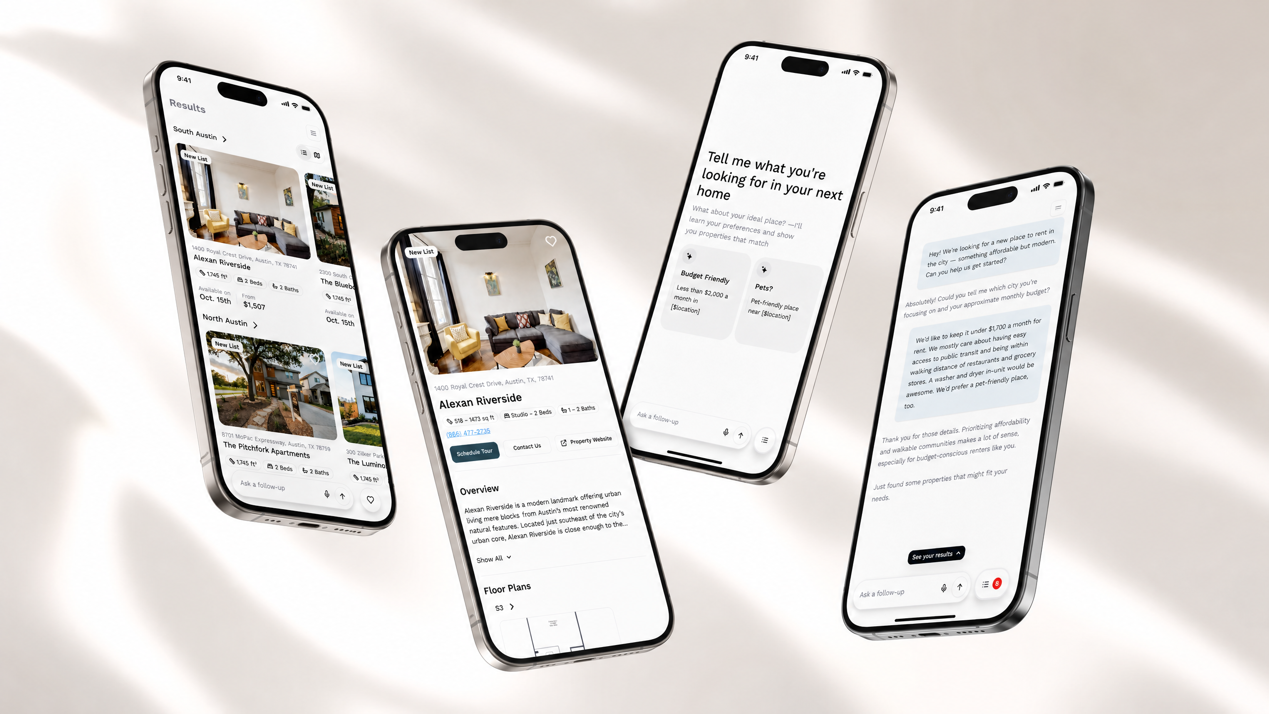
The flow maps a complete renter journey across eight screens. Each screen was designed around one behavioral principle.
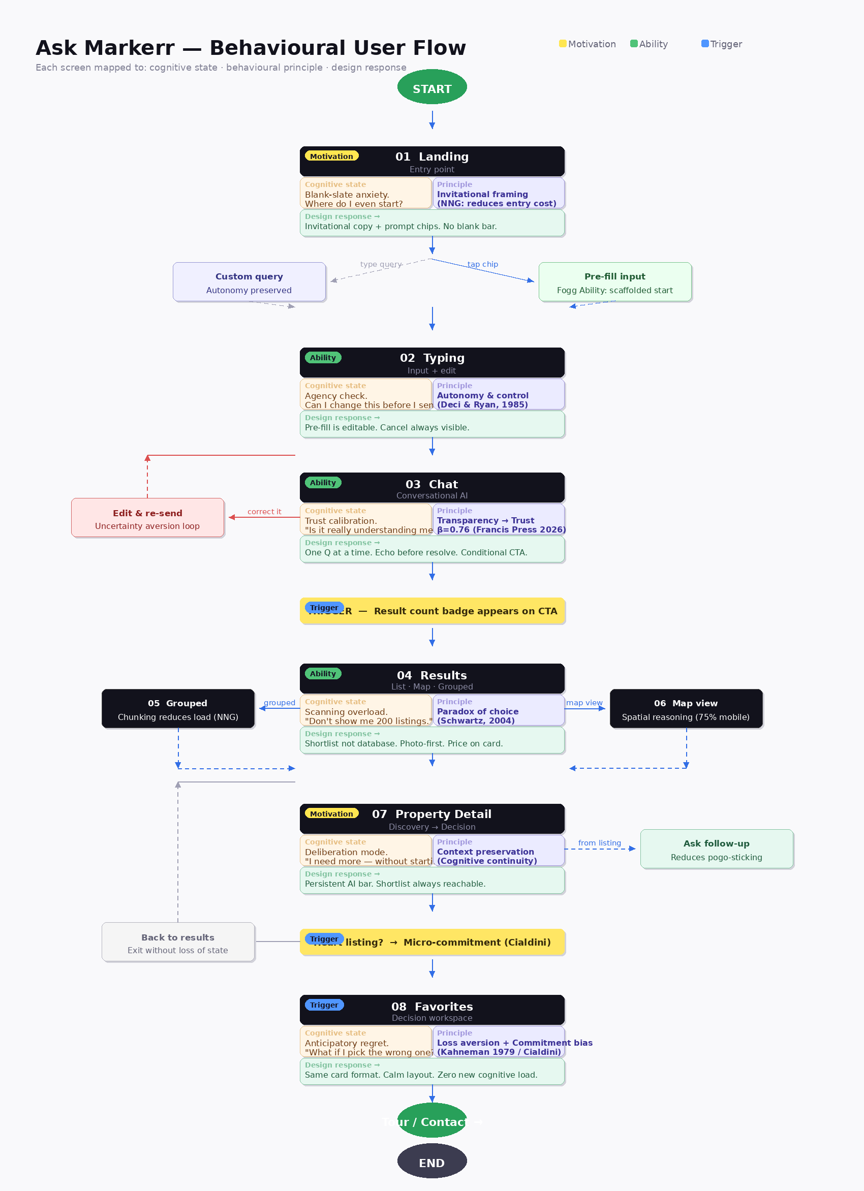
End-to-end flow — invitation and editable chips through chat, grouped results and map-first comparison, then detail and favorites on a single visual spine. Eight screens, zero dead ends.
Decision: Invitation over instruction at entry
Problem: A blank search bar creates a cold start — the user faces a cursor and a question they can’t yet answer precisely.
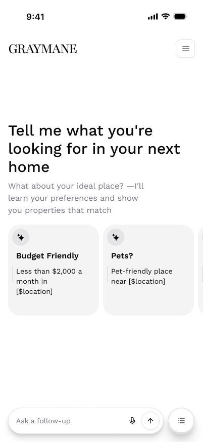
What I designed: An invitational prompt — “Tell me what you’re looking for in your next home” — with pre-filled chips for budget and pets, the two most common first searches.
Why this matters for the user: 59% of renters are explorers without firm intent. An invitation starts a dialogue; an instruction assumes competence they don’t yet have.
Why this matters for the business: First-message drop-off is the top conversion killer in conversational AI. Reducing it directly affects the pipeline into tour requests.
What I rejected: Auto-submitting chips (removed user control); a text prompt with examples (added cognitive load at the worst moment). Chips pre-fill the input — they don’t submit. The user stays in control.
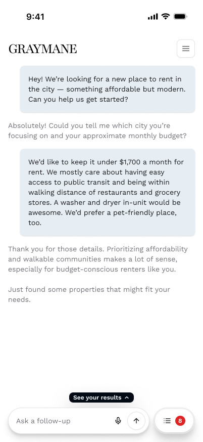
Decision: Echo before resolve — the primary trust mechanism
Problem: 40.7% of users distrust AI outputs. Skipping confirmation and jumping straight to results is the fastest way to break that fragile trust early.
What I designed: The AI asks one question at a time. When the user shares their full picture — budget, transit, pets, laundry — the AI echoes it back before showing results. The “See your results” CTA only appears after confirmation.
Why this matters for the user: Transparency is the strongest predictor of AI trust (β = 0.76). Confirming what the AI understood is not a nicety — it’s the primary mechanism through which users decide whether to trust what comes next.
Why this matters for the business: Skipping the echo erodes trust by −14%. Every tour request downstream depends on users believing the results were actually tailored to them.
What I rejected: Surfacing the result count badge before the echo. Early testing showed users jumped to results before the AI had enough signal — producing low-quality matches and a broken first impression.
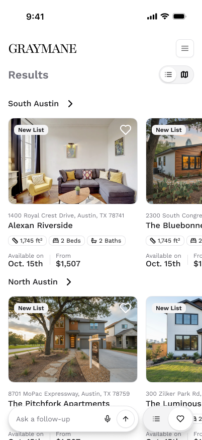
Decision: A shortlist, not a database
Problem: Filter-based results return everything that matches. That’s not a shortlist — it’s a new version of the overwhelm the user just escaped.
What I designed: Results open with “Based on our conversation…” — closing the loop. Each card leads with a photo, shows the price, and surfaces pet-friendly and accessibility tags without any drill-down required.
Why this matters for the user: Mobile users decide visually before they read. Price belongs on the card — 60% of searches start with budget. Dealbreakers visible at a glance means no tapping into a detail page to find out the apartment doesn’t allow dogs.
Why this matters for the business: Reducing friction between result and tour request is directly measurable. Every tap removed from the dealbreaker-discovery path increases tour conversion likelihood.
What I rejected: Pagination and “load more” patterns — they reintroduce the database feeling the conversational entry was designed to escape.
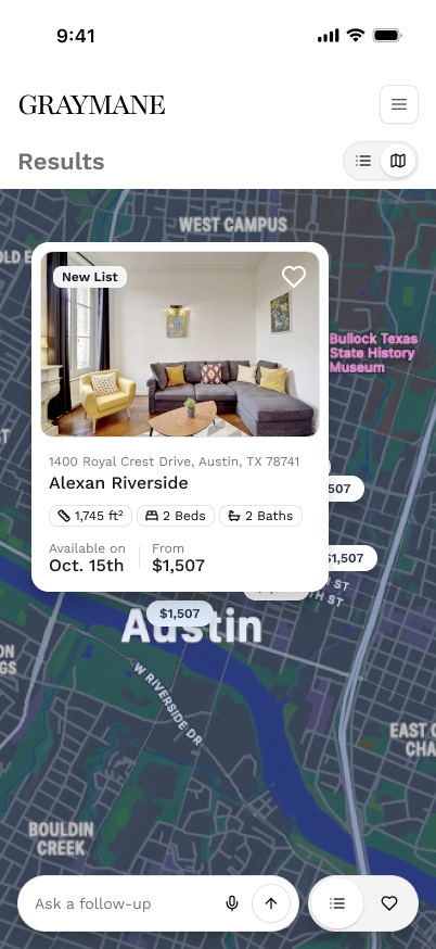
Decision: Map as output, not filter
Problem: Most apartment search products treat the map as a secondary filter layer — something you switch to after you’ve already searched. That’s backwards for how renters actually reason spatially.
What I designed: All matched properties appear as price pins on a dark-mode map. The user sees cost in place — no tap required to check if something is affordable.
Why this matters for the user: 75% of mobile renters expect spatial-first reasoning. Budget-first users resolve their top question spatially, instantly. Price pins replace dots — the most common question is answered before it’s asked.
Why this matters for the business: Spatial results reduce the re-search loop. A user who can see “this neighborhood is within budget” doesn’t need to navigate back to refine.
Accessibility flag I raised: Pinch-to-zoom only is a WCAG 2.5.1 failure. Single-pointer ± controls were added to the specification before handoff.
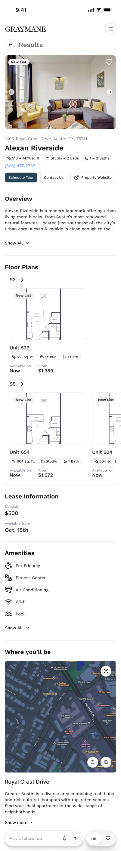
Decision: Persistent AI input on the detail page
Problem: Once a user reaches a listing, they shift from discovery to decision — and they have follow-up questions. Forcing them to navigate back to the chat to ask them breaks the flow at the highest-intent moment.
What I designed: The AI input bar stays visible on the detail page. “Is this building accessible by metro?” — asked from the listing, answered without leaving it. The shortlist is preserved. The user is never stranded.
Desktop: The layout splits — chat stays in a persistent left panel while results fill the right. The renter never has to choose between context and listings; both are always in view.
Testing
The hardest micro-decision in testing was the conditional CTA timing: when exactly should the result count badge appear?
Early surfacing — before the echo — caused users to jump to results before the AI had enough signal. Late surfacing felt like the AI was hiding something. The echo-confirmation trigger was the resolution: badge appears only after the user sees their constraints reflected back.
One assumption testing broke that I hadn’t expected: I thought progressive disclosure of the result count — appearing gradually as the user answered questions — would feel rewarding. In testing it felt manipulative. Users wanted to know if results existed before committing to the full conversation. The echo-confirmation trigger was a better answer: show the count after I’ve demonstrated I understood them, not before.
One thing I would have instrumented earlier: drop-off data by question position in the chat screen. The one-question-at-a-time rule is evidence-backed, but I’d want to know which question in the sequence causes hesitation before considering any modifications in production.
Final Design
The three decisions that define the experience:
- Echo before resolve — the AI restates intent before acting, the primary trust mechanism in the entire flow.
- Dealbreakers on the surface — price and pet policy visible at the card level, no taps required.
- Map as output, not filter — spatial reasoning is the dominant mental model; the map earns its position as a primary results view.
Full mobile flow — from the invitational landing through chat, grouped results, map, detail, and favorites. The visual thread is continuous; no orphan states, no dead ends.
Impact
The outcomes were directional and benchmark-grounded. Markerr did not yet have production data at handoff — the numbers below are from the behavioral research that underpinned every design decision:
| Metric | Benchmark source | Signal |
|---|---|---|
| Listings viewed | Redfin, Nov 2025 | 2× more with conversational vs. filter search |
| Tour request likelihood | Redfin, Nov 2025 | +47% with conversational search |
| AI trust (transparency effect) | Francis Press, 2026 | +36% when AI explains reasoning |
| Trust erosion (no echo) | Francis Press, 2026 | −14% when AI skips confirmation |
What this demonstrates as a designer: I can translate behavioral evidence into concrete product mechanics, design AI-assisted flows that balance guidance with user agency, and argue for counterintuitive decisions when the research supports them.
Learnings
The hardest design work on this project was subtraction. Fewer questions per turn. Fewer filters at entry. Less information on the card surface. Every cut was intentional and evidence-backed.
What worked: Leading with behavioral evidence made every stakeholder conversation faster. When a design decision has a citation, it stops being a matter of opinion.
What was hardest: Getting the conditional CTA timing right. Knowing when to surface the result count badge required multiple prototype testing rounds before echo-confirmation landed as the right trigger.
What I’d do differently: I would instrument the chat screen from day one — specifically, drop-off data by question position. The serial questioning rule is supported by research, but I’d want production signal before committing to it at scale.
What I’d explore next: I want to understand how people’s confidence changes when an AI brings genuine domain knowledge into the conversation — not just structured questions, but real insight. Markerr has deep rent and market data. I’d want to test whether a renter who gets neighborhood-level context mid-conversation (“rents in this area have dropped 8% this quarter”) makes more confident decisions — and whether that kind of signal reduces the re-search loops we designed around.
The best AI UX is invisible friction removal. The interface should feel like talking to someone who already knows you — not like interacting with a model that’s waiting for the right prompt.